Wednesday, 20 October 2010
Sunday, 17 October 2010
Typography
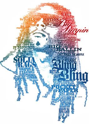
"The layout of text on a printed page, sign or other object. It refers to the style, size and
layout of the text characters (fonts)."
Sometimes typography is all you need to communicate your ideas effectively. Graphics can support the type or type can support the graphics, but to deliver the message precisely, you need to make sure your type is expressive enough, your design is distinctive enough and the composition is strong enough. The results are sometimes crazy, sometimes artsy, sometimes beautiful, but often just different from things we’re used to. Thus designers explore new horizons and we explore new viewing perspectives which is what inspiration is all about.
A few different examples of Typefaces..
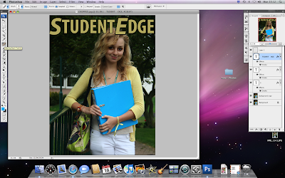
What I intend to use on my magazine..
My magazine is aimed at both females and males aged 16-19. I need to consider my target audience carefully when choosing my typefaces as well as everything else featured on the magazine. The font can't be too girly, and it can't be too male-ish. I asked my target audience which font they preferred from these fonts:
Friday, 8 October 2010
Why did you like the particular Style you chose?
Harriet Trayling: I like the things that feature on it and the layout of it.
Joe Bell: It looks tidier and more interesting.
Alicia Barclay: I like the different things on it, they interest me. The polaroid idea is pretty cool as well.
Callum Weir: It looks presented better and a lot tidier than style 2. Though mixing the ideas from style 2 to style 1 would make it look better.
Subscribe to:
Comments (Atom)


