Bradford Foundation Portfolio Candiate Number: 5180
Wednesday, 20 October 2010
Sunday, 17 October 2010
Typography
"The layout of text on a printed page, sign or other object. It refers to the style, size and
layout of the text characters (fonts)."
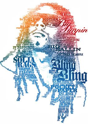
Sometimes typography is all you need to communicate your ideas effectively. Graphics can support the type or type can support the graphics, but to deliver the message precisely, you need to make sure your type is expressive enough, your design is distinctive enough and the composition is strong enough. The results are sometimes crazy, sometimes artsy, sometimes beautiful, but often just different from things we’re used to. Thus designers explore new horizons and we explore new viewing perspectives which is what inspiration is all about.
A few different examples of Typefaces..
What I intend to use on my magazine..
My magazine is aimed at both females and males aged 16-19. I need to consider my target audience carefully when choosing my typefaces as well as everything else featured on the magazine. The font can't be too girly, and it can't be too male-ish. I asked my target audience which font they preferred from these fonts:
Friday, 8 October 2010
Why did you like the particular Style you chose?
Harriet Trayling: I like the things that feature on it and the layout of it.
Joe Bell: It looks tidier and more interesting.
Alicia Barclay: I like the different things on it, they interest me. The polaroid idea is pretty cool as well.
Callum Weir: It looks presented better and a lot tidier than style 2. Though mixing the ideas from style 2 to style 1 would make it look better.
Tuesday, 28 September 2010
 In this shot, the model is not looking at the camera so I don't think the picture is entirely appropriate as the reader needs to draw some kind of relationship with her when they pick up the magazine.
The lighting conditions aren't very good in this photo and it has led that the top of the photo looks washed out so it doesn't have sufficient impact for my purpose.
The lighting has also made the picture look quite surreal because on the right side of the photo, the trees look sharp and clean whereas the left side of the photo looks entirely washed out and weak.
The model doesn't have enough emphasis on her either and doesn't stand out in any way which is needed on the magazine. The front of the magazine needs to have a presence about her.
Photo 2
 Although this picture shows the right image i want to portray of the school, again, this photo does not show any eye contact and my magazine relies on the relationship built by the model and the student reader. The saturation of the background images (such as the bush behind) is much higher than the model's saturation which draws her out and makes it that the model isn't the main object in the picture. The paper in this photograph symbolizes her a-level results, and the smile symbolizes her getting the results she wants. I would think that this photo would be more suitable for a prospectus for a new student because it is showing that the school gets brilliant results and would get students to apply there.
Photo 3
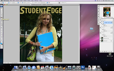
This image has the right lighting on the model and the background which makes the photograph look very professional. All of the colours seem to complement the photo and the smile on the model's face shows that she is having a good time which makes the photo stand out more. The background images such as the tree and the railing also make the picture of the school seem a pretty, calm environment.
Like with all my photographs, I have mentioned that it is very important for the model to draft up a kind of relationship with the reader by looking into the camera. The model does it perfectly here, and smiles at the camera showing that she is friendly and fun.
Monday, 27 September 2010
Subscribe to:
Comments (Atom)


